May I wish all PRIME readers a great 2014. I didn’t kick off the New Year too well – my first tweet of the year from PRIME claimed that the latest revised UK GDP figures from ONS show that the economy had indeed suffered a “triple dip” – when what I meant to say was that there had been a recession lasting 3 consecutive Quarters, from Q4 2011 to Q2 2012. Embarrassing (even sub-prime?) – especially as it got heavily retweeted!
In fact, following a small rise in Q3, there was a further fall in GDP in 2012 Q4, making a total of 4 falls in 5 Quarters, which surely ought to count as an honorary double dip in its own right, and added to the 2008/9 recession, score as a triple!
Moreover, the way ONS showed the statistics made it look as if there had not even been a “double dip” recession, since one quarter with a small decline was show as zero. This had led Ed Conway of Sky News, back in June, to write an article headed “Recession – what recession? Osborne can claim”.
In reality, none of the ups and downs are in themselves statistically significant, and my aim was rather to underscore just how poorly (and flatly) the economy had fared until very recently indeed – whilst most commentators and most of the media seem to think that Plan A had actually worked! On the contrary. The government’s austerity policies had a powerful negative impact on the economy for 2 years. From Q3 2010 to Q4 2012, the ups (+) and downs (-) of GDP per Quarter were as follows:
+ – + + + – – – + –
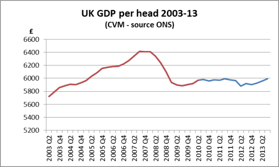
Overall “growth” over this period from Q3 2010 was around 1%, remaining well below the increase in population, and GDP per head (a common proxy for well-being) had therefore fallen back. In 2012 Q2, from ONS statistics, it was 1.5% lower than when the Coalition government took office, reaching its lowest figure since late 2003. Only in Q3 2013 has it got back above the level when it took office (and which it had reached in 2011).
Here is our chart, from the ONS figures, showing real (constant volume) GDP per head over the last 10 years.
Even now, we are 6.5% below the peak. So when people say they feel worse off, this chart goes a long way to explain why they’re right! But look at the red line after the trough of the recession – it was on a marked upward curve, which then falls away.
In my next post, I look at the economy in 2013, and how progress relates to some of the key the indicators for success that Chancellor Osborne set for the UK economy back in February 2010.


One Response
I feel the American double dip recession might happen as early as May 16, 2014.