

We know that the UK economy has remained in a rut, plagued by foolish austerity and declining real wages, since the great financial crisis. We know too that the Eurozone suffered its own, largely self-imposed, economic stasis or decline – notably from 2010 to 2015, with unemployment over 10% till late last year.
So I thought it could be interesting to look, in a simple way, at the performance of a set of mainly developed economies, in Europe plus a few from other parts of the world, and compare their progress – or lack of it – over the 10 year period 2007 (representing the pre-crash peak for many countries) to 2016. And then see where the UK sits in comparison with others.
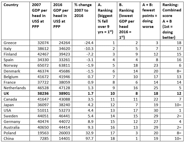
I have added China and Poland as examples of what is happening elsewhere, in economically relatively successful states not yet deemed “advanced” economies. They zoomed ahead – in terms of changes in GDP per head – over the decade.
The two indicators
For the present purpose, I took just two indicators. Neither is fully satisfactory, but they do show the general trend over the period, and in general terms how well-off a country is. What they do not show, of course, is how different classes are doing within each country – the degree of inequality within each society is equally important but not captured here (I will try to add this dimension next time). The two indicators I have used are:
- the percentage change in GDP per head of population at PPP (purchasing power parity) over the whole period 2007-16, with data shown in 2011 constant US dollars. [If you want to get the average annual change in GDP per head, you need simply to divide by 9.]
- the absolute level of GDP per head in the last year of the period, 2016, on the same basis.
All data are taken from the website of theglobaleconomy.com
I have then done two columns of “ranking”, showing the worst performing country as 1st in each case, and the best or highest performing one at number 18. Finally, in the right hand columns, and assuming the two indicators to have equal weight, I simply add up the two sets (A + B) for each country and then offer a final ranking – in this case with the highest scoring country shown as 1st, i.e. having the best record taking the two together. (And the worst performing state at 18).
The results
The countries at the top of the list are probably not a surprise – the USA comes out just on top, having the 2nd highest GDP per head, and having done a little better over the decade than many others (of course, if inequality was added as indicator we may doubt the USA would be at the top).
Then follow Sweden and Australia, followed by Germany and the Netherlands. Sweden performed reasonably well on both indicators, and Australia has the greatest increase in GDP per head of the developed economies. Germany had the second highest increase in GDP per head of the developed economies. The Netherlands has throughout had a higher level of GDP per head, but its relative position is slipping, as its post-2007 increase in GDP per head is negligible (1.3%).
The country with the highest GDP per head, throughout the period is Norway, but it comes in only 6th in the combined ranking, as GDP per head has actually fallen since 2007, by 1.9%.
Please note that Japan has a relatively positive result in terms of the percentage change over 9 years, with an increase of 4.2%.
And it can surely not be mere coincidence that 7 out of the 9 worst performing countries in the rate of change between 2007 and 2016 are members of the Eurozone, while of the “top” nine on this indicator, only one country belongs to the Eurozone – Germany. The tough austerity policies pursued for the Eurozone by the European institutions, and driven by the German government, have been a decade-long disaster.
Source: theglobaleconomy.com
Of the countries that have done badly on these indicators, it will not come as a surprise to see that Greece is at the bottom. Nor probably will it surprise us – though it may dismay – to see Italy at 17th out of 18, due largely to the fact that its GDP per head from 2007-2016 fell by an enormous 10.3%.
Despite its recent economic improvement, Spain still comes out badly (15/18) with mediocre results on both indicators. Another maybe more surprising outcome is that Finland finishes up as 15th out of 18, because (post-Nokia and all that) its GDP per head fell by a huge 7.2% over the 9 year period.
In fact, despite their positive reputations for good economic performance, the Scandinavian countries have performed poorly on these combined indicators, with only Sweden moving forward. The other three (Norway, Denmark, Finland) have all suffered a fall in GDP per head over the period 2007 to 2016.
And the UK?
And finally, what of the UK? Well, despite everything, GDP per head at PPP has risen a tiny amount between 2007 and 2016, by 1.7%, or a little under 0.2% per year on average. But in terms of GDP per head, the UK is well down the list, with a 2016 figure of $38,901 – over 9% below Canada, over 10% below Germany and Australia, and way behind Sweden, Denmark, Norway, USA…
We were only 10th out of 18 on the percentage change over 9 years (i.e. with 9 doing worse), but with the 8th lowest GDP per head. In the final combined ranking, the UK comes out as 12th of 18 countries, just below Japan and China, and a fraction above Belgium and France.
All in all, an economic track record of mediocrity. And that’s before we started to slip, in Brexit-preparing 2017, behind even the laggard Eurozone economies.

