
If you add up the percentage falls in UK real pay for each later year, taking 2008 as the base for calculation, you reach an overall loss over 7 years of 38.5% of the 2008 wage (see Table 1 below). This means that a notional worker employed at an average wage in 2008, if employed throughout at the evolving annual average, will have lost over one-third of a year’s salary (in real terms) compared to her 2008 pay. Or roughly £10,000 in total. And that would just be to stand still in terms of pay….
This is the essential backdrop to the employment data for November 2015, released by ONS earlier today.
True, the headline UK employment and unemployment figures for the 3 months to November paint another positive picture. The number of those aged 16 to 64 in employment rose by 213,000 over the previous (June-August) months, and including those 65 or older, the increase was 267,000.
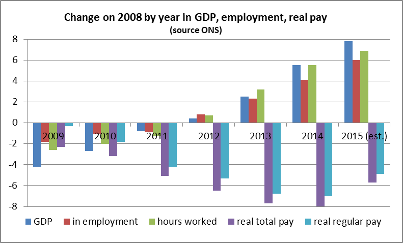
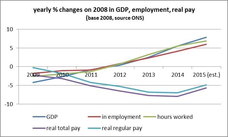
But as we know, there is a darker side to the picture – the gain in employment is a trade-off in terms of pay. The gain in employment is closely matched by the fall in pay, as Table 1 below shows. In 2014 the number in employment was up 4.1% on 2008 – but real pay was down by double the rate, at 8%. In 2015, the increase in employment is just about equal to the fall in pay.
Let’s stick with the positive for the moment. The year-on-year increase in those in some form of employment is 589,000, while the 16-64 population (the potential workforce) is estimated by ONS to have risen over the year by only 100,000 (though this seems curiously low – the population aged 16+ is estimated to have risen by 325,000). Unemployment for those aged16+ has fallen in the year by 239,000 to 1.656 million.
Over the last Quarter (to November), there were 160,000 more employees, and 121,000 more self-employed. So the self-employed are again a big proportion of the total.
There were 110,000 more full-time employees, and 50,000 more part-timers than in the previous 3 months. There were also 84,000 more full-time self-employed, and 37,000 more part-time self-employed. So some of the gain is in part-timers and a fair proportion in self-employed, but over one-third is in full-time employees.
It’s time to turn to pay (and n.b. the ONS data for wages applies to employees, not to the self-employed, so the overall picture is probably worse). For another month, regular and total pay rose annually by more than CPI inflation (currently 0.2%) but not by a big margin. And as yet, nowhere near enough to compensate for the huge fall in real pay since 2007/08.
Total pay in November rose by 2%, the same annual rise as for the last 3 months’ average. Regular pay (excluding bonuses) was up 2.1% in November, 1.9% averaged over the 3 months. Two service sectors saw significant annual increases – construction workers (+5.6% total pay) and those in retailing/hotels/restaurants (+3.2%).
In order to see how the trade-off between the number of those in employment (of whatever kind) and levels of pay (of employees) has worked, in Table 1 we have taken data from 2008 (as base 100) and show the annual percentage changes from that baseline. To give the context of the overall economy, we have included the GDP figures (also calculated as the annual % change over 2008 level).
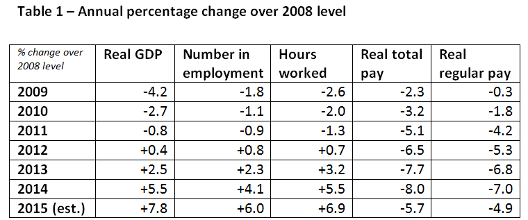
Sources: all from ONS datasets as at 20th January 2015
Real GDP is annual GDP data, with estimate for Q4 of 2015 included
Number in employment and hours worked use September-November data per year
Total and regular real pay use annual data; for 2015, index of 112.5 is used for total pay, and 111.3 for regular pay.