Policy Research in Macroeconomics

United Stag-Nations – the decayed decade for GDP per head

When looking at how economies are doing, we tend to look mainly at the trend in GDP.  But in terms of economic well-being, a clearer (though still imperfect) indicator is GDP per head of population – how the economy is doing relative to changes in population.

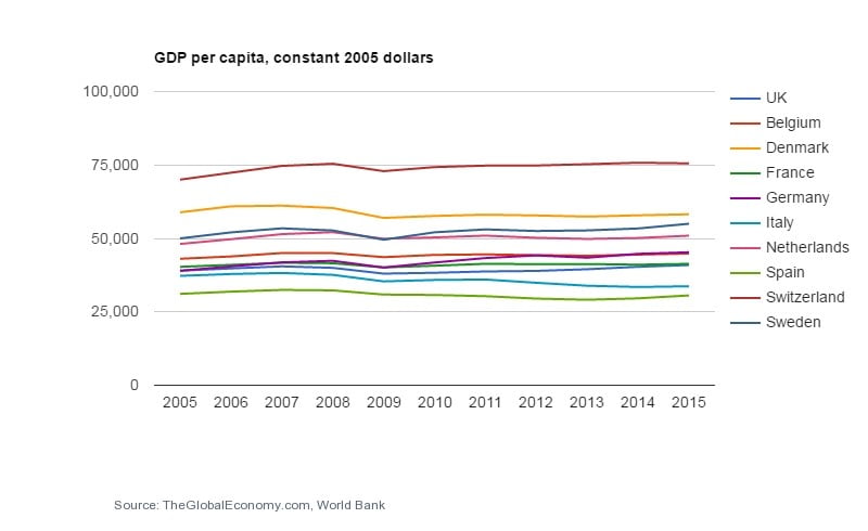
In general, since the end of World War 2, in most all so-called advanced economies, there was an almost inexorable upward slope in any chart on GDP per head of population.  But over the last decade, and in particular since 2007-08, many countries – and notably those in Europe (especially the Eurozone) have reached a virtual plateau. In a few cases, there is still a tiny, upward glide.  In others, the line is flat.

And in several cases, the slope is downward.

GDP per head Indicators

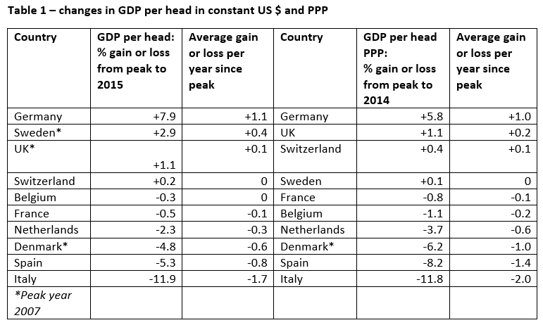
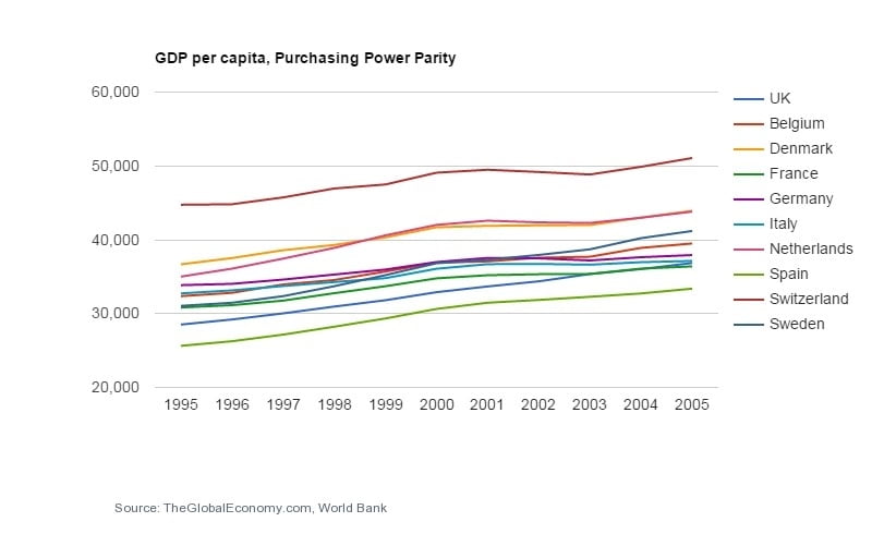
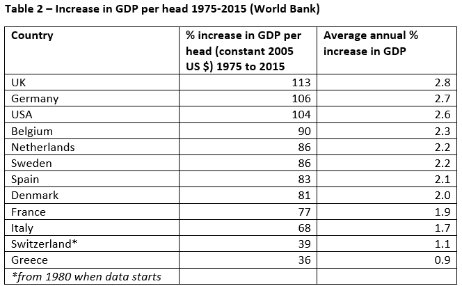
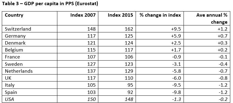
There are two indicators we can use for comparing trends in GDP per head.  The first is simply to take real GDP (assessed in constant US dollars or in Euros), and the second is to look at GDP per head in purchasing power parity (PPP).  I have taken both indicators, using data from the World Bank’s “TheGlobalEconomy” website – the first in GDP per head in constant 2005 US dollars, and the second in PPP [1].

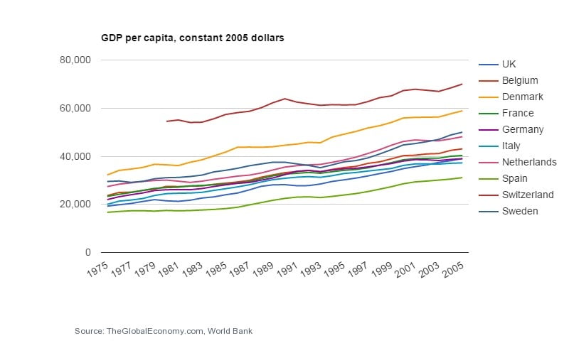
I have taken a set of 10 European countries, EU members plus Switzerland, but excluding the central and eastern European joiners since 2004, whose development path is different, and looked at the changes in GDP per head since 1975. Six of the ten countries have been members of the Eurozone since it was set up.

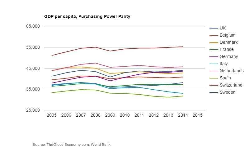
The chart at the head of this article shows the position for GDP per head in constant US dollars from 2005 to 2015.  Overall, I feel that the Flat Earth Society would feel quite at ease in this chart. For most of the lines are indeed, well, flattish – though with a financial crisis kink in 2009.  

There were, on this indicator, 7 countries whose GDP per head was higher in 2015 than in 2005 – the three losers over the whole decade were Denmark, Spain and Italy.

When we look at GDP per head in PPP (the chart above), the differences are a little stronger – for the losers.  There were again 4 gainers (Sweden just scraping in) with Germany well ahead, but Belgium, Netherlands, Denmark and Spain were all well down on their peak year.  (The PPP data only goes to 2014, it should be noted(.

Table 1 shows the change in percentage terms from the peak year (mainly 2008, but for some 2007) to 2015 for each country.  

This period of stagnation or worse for most of our set of countries contrasts with the previous 40 years.  Here is the chart of GDP per head in constant US dollars, for the period 1975 to 2015.  The trend is of course very largely upward:

GDP per cap 1975 to 2005 constant $.jpg

The data for GDP per head in PPP only starts in the early 1990s, but here is the chart for the decade 1995 to 2005, which once again shows an almost universal upward slope:

And next, in Table 2 I have calculated the percentage change in GDP per head in constant 2005 US dollars, for the period 1975 to 2015.  For this Table, I have added Greece and the USA for comparison.  The attentive reader will see that the UK Tops the Table, with an increase of 113%.  This Table covers almost the entire period of the UK’s membership of the EU… it seems hard to argue that our membership was a great disadvantage overall, though fluctuations in the £/$ rate seem to flatter the UK’s position here.

Comparing GDP per head in Euro terms

Now the data so far used in this article has been based on US dollars – while a majority of our countries are in the Eurozone.  So the fluctuations in currencies do have a significant impact at some points and create some anomalies, though the big picture remains. (The mundane reason for mainly using data in US dollars is the ease of access to data from the World Bank and OECD sites compared to Eurostat…).  For comparison, I have also taken data from Eurostat for GDP per head of population in “parity purchasing standards” or PPS, which I understand to be virtually the same as PPP in methodology.  I have compared countries for the change in index (EU28 = 100) between 2007 (the peak in this table for most countries) and 2015, as follows:

Here, the relative position of the US and UK, as well as Switzerland seem to have been affected by the exchange rate against the Euro.

But we need to stick with the big picture.  which is that more “advanced economies” in Europe have seen falls in GDP per head, however measured, than rises since the pre-crisis peak – and that even where there has been a rise, it is very modest.

In short, we have seen a sustained period of stagnation in this key indicator of economic well-being, in Europe but also across the Atlantic.  Taken with the falls in real wages, we can see why so many are demonstrating discontent in the political arena.

Footnote

[1] The explanation from the website says: “One thousand U.S. dollars can buy much more in Mexico compared to the U.S. since prices in Mexico are lower. To account for the differences in prices, one should look at the GDP per capita in Purchasing Power Parity terms. In that way, one compares countries in term of real income (what can be purchased) as opposed to the dollar income.”

Leave a Reply

Your email address will not be published. Required fields are marked *

This website collects cookies and analytic data. To use our website you must consent.
For more information read our Privacy Policy.