Policy Research in Macroeconomics

The UK’s “new economic model” – deferred or dumped?

The UK economy has – in terms of GDP – performed somewhat better in 2013 than almost all analysts expected. That includes us in PRIME.  But the “growth” – which looks like being around 1.75% year on year – is nothing like as large or as entrenched for the future as many commentators want to persuade us. It comes after a year (2012) of utterly dismal economic performance, due largely to the austerity policy of the government, in which real GDP per head of population fell again, with GDP rising by just 0.25%.

But here we go again. Chancellor George Osborne tells us – 16 months ahead of the next General Election – that we must cut public spending by a further £25 billion after the election.  Whatever the state of the economy.  The problem, he claims, is public spending.  Yet the austerity policies pursued – though not as severe as the Eurozone’s masochistic policies – have contributed directly and significantly to the UK’s weak economic performance till mid 2013.

Let us travel back in time to February 2010, less than 3 months before the last General Election.  George Osborne delivers the Mais Lecture.  In it he says:

“We have to move away from an economic model that was based on unsustainable private and public debt. And we have to move to a new model of economic growth that is rooted in more investment, more savings and higher exports.”

First, note that – at that time – Mr Osborne was rightly concerned about the level of private debt as well as public debt. While private debt has slightly declined, the ‘deleveraging’ has been modest over the last 3 years. But ever since he became Chancellor, he and his government have turned a blind eye to private debt, concentrating solely on public debt.

And as regards more investment and higher (net) exports, well, see below.

So the big question is whether the ‘new’ economic model promised has been ditched in favour of, well, the old economic model – and indeed whether either model is right for Britain today.

BBC Business Editor Robert Peston puts it nicely today in his blog:

“Households are behaving in a way that Keynesian economists say the chancellor should have been acting. And the chancellor has on the kind of hair shirt that consumers should perhaps still be wearing, given that they went so spending and borrowing bonkers in the boom years.”

Let’s look a bit deeper.

GDP and Gross Value Added (GVA)

First, let us look at the main components of GDP, from the 3rd Quarter 2013 ONS statistics, to see what has and what has not changed significantly since the General Election in 2010. 2010 as a whole is used as the baseline index (=100) by ONS, so this provides a reasonable proxy for the comparison.

For the record, GDP in 2010 rose by 1.7%, in 2011 by 1.1%, and in 2012 by…[drumroll] 0.25%.  It seems that 2013 will be roughly the same as…2010.

On the production side, we find that Gross Value Added has increased by 3.9% over the 3 year period to Q3 2013 – an average of 1.3% per year.

Of this 3.9% increase in GVA over 3 years, some two-thirds (+2.1%) is attributable to the “output” of the broad service group “professional, scientific and administrative”.  This is therefore, by a large margin, the most important change over the period.

Wholesale and retail trade accounted for 0.7% of the increase in GVA, transport storage and communications for 0.3%, and real estate for 0.5%.  On the other hand finance and insurance have made a negative contribution of -0.3%.

Within the mainly public sector areas, education has contributed 0.25% and health and social work 0.6% to the increase in GVA, partly offset by the negative contribution of public administration, -0.4%.  This still means that public services have made a positive contribution to GVA.

Manufacturing has made no contribution to the increase in GVA so far, whilst construction has reduced it by -0.1%, and mining oil and gas extraction has subtracted -0.6%.

Due to increases in spending on health in particular (and due to a more doubtful statistical assessment of the deflator for public services), overall general government consumption expenditure appears to have risen over the 3 years, roughly by the increase in population (around 0.8% per year).  Household expenditure has risen by a little more (around 1%) than the increase in population.

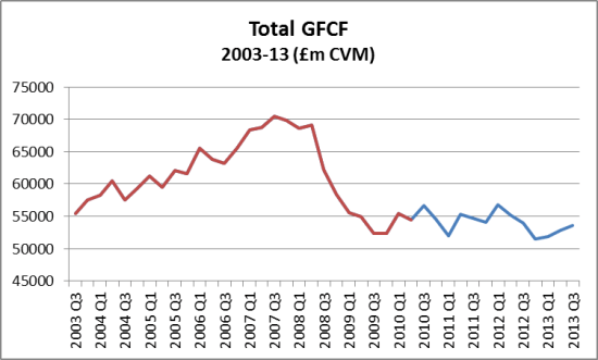
But gross capital fixed formation – private and public combined – shows an actual fall over the period since the last General Election.  Despite the fact that in 2013 it has risen slightly each Quarter, total GFCF in Q3 2013 remains below the level of 2010 and most of 2011:

UK GFCF 2003-13 Q3

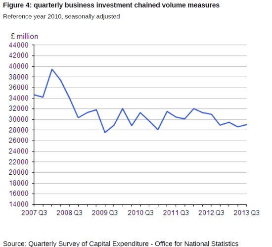
And the next chart, from ONS, gives the picture for business investment, one of the elements highlighted by Mr Osborne in the Mais lecture:

bus inv to Q3 2013 chart

Balance of trade and current account

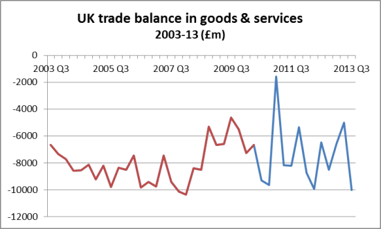
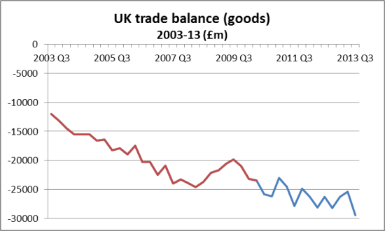
Let us turn to trade and to the UK current account.  UK trade in services (whether exports or imports) remains relatively constant in recent years, whilst trade in goods is much more volatile. In constant (2010) values,  total exports have risen each year – but so have total imports.  The difference between the value of exports and imports has varied from £25.8bn in 2009, £32.9 bn in 2010, to a more modest £14.3 bn in 2011, but up to £24.1 bn in 2012.  2013 looks likely to produce a similar result to 2012.

The following two charts show the balance for total trade (goods and services) and for trade in goods, over the 10 year period from 2003 to 2013.  Please note that they use current prices, so do not take account of inflation.

UK trade balance in goods & services 2003-13

UK trade balance goods 2003-13

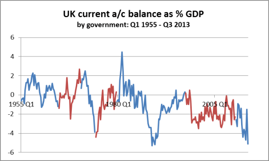
Moreover, looking at the UK current account as a whole, showing the deficit as a percentage of GDP, we can see from the next chart that the UK’s position has worsened under the current government:

UK current account balace as percent GDP

As yet we can see no “new model” emerging here!

Private debt and savings

The third key element of the new economic model – after increased investment (not yet) and increased exports (not much change so far) – was increased savings.  There are perhaps two elements – actual saving rates, and the amount of private debt.

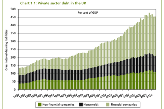
On private debt, I reproduce first a familiar chart, from the 2010 budget report, showing how it had exponentially increased from around 1990, to a total of well over 400% of GDP.

Private_sector_debt_uk

The McKinsey Institute has published reports on debt and deleveraging which has looked at the picture of the UK and other major economie, the latest taking us up to Q2 2012.  This shows that household and non-financial companies’ debt as % of GDP had slightly reduced, whilst financial corporations’ debt remained as high as before.  But the UK continues to have one of the world’s highest overall levels of private sector debt.

UK debt chart McKinsey to 2012 Q2

UK debt chart McKinsey to 2012 Q2

George Osborne actually said in 2010 that “private sector debt was the cause of this crisis”, whilst adding that “public sector debt is likely to be the cause of the next one”, and this chart shows just how small public sector debt was at the start of the financial crisis – and how even with the government cutting capital investment and thus injecting a de-stimulus, the public sector’s debt was bound to increase.  The problem has been that the government’s de-stimulus meant that private sector recuperation was delayed.

As to household savings rates, the next chart (ONS data) shows how – over 20 years – they had come down progressively from the high levels of savings (10%+) during the recession of the early 1990s to almost nil by 2008.  Thereafter the savings ratio leapt to 8%, but in 2 of the last three Quarters, it has been at relatively low levels again.

household savings ratio 1993-2013

household savings ratio 1993-2013

Meanwhile, lending for mortgages and  consumer credit (unsecured borrowing) are now leaping ahead. From August to November 2013, the number of loan approvals for house purchases rose from 63,668 to 70,758, or 11%.  The value of loans approved over this 3 month period rose by 15.6% to £11.1 bn.

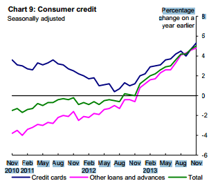
Consumer credit is now growing again at an annual rate of over 5%, both in relation to credit card borrowing and other (Wongaland etc.) forms of borrowing.  This is the Bank of England’s chart showing the rapid change from falling to rising borrowing:

consumer credit Nov 2013

consumer credit Nov 2013

We also learn from the Bank of England’s latest statistics that non-financial businesses are continuing to pay back more than they borrow to UK banks, by a significant margin.  The total has reduced from £520 bn to some £450 bn since April 2011.

No new model?

When George Osborne spoke in February 2010 about the need for higher investment, higher exports and higher savings, he seems to have had the German export-led model in mind – for sustained higher savings by households was of course likely to lead to less domestic spending.

Instead, we have a situation where net exports have only modestly if at all increased, where business investment has not increased so far, and where private debt – even if slightly down on 2009/10 – remains far higher than at any earlier point in the past.

Moreover, new lending and borrowing to private individuals, secured and unsecured, is rapidly  increasing once again.  The London housing market is without doubt a bubble leading to misallocation of capital, and we may expect other regional hotspots soon.

Meanwhile, construction and manufacturing (especially transport manufacturing) are showing signs of increased activity, so we may hope that they may, probably modestly, help to provide a wider base for progress in 2014.  But the risks to the economy remain significant in terms of sustainability.

Government expenditure (excluding health) is still being substantially reduced and will continue to decline, as we have just been reminded by the Chancellor, and the slight improvement (from a very low base) of the Eurozone economy may offer the UK as much trading competition as opportunity, given the Zone’s export-led policy imperative.

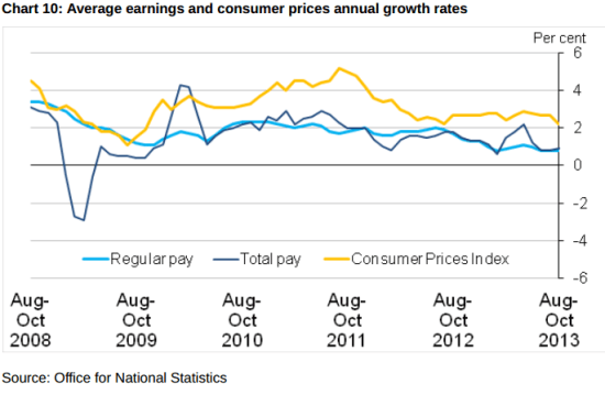
The final issue in this round-up is the employment/unemployment dimension. As we have previously noted, the UK has had more people working longer hours for less pay to produce not much more “stuff” (output).  Individuals’ average real pay has continued to decline, as the ONS charts have told us:

wages and inflation - ONS to Oct 2013

wages and inflation – ONS to Oct 2013

But since the number of those in employment has definitely increased (it appears by around 500,000 in the last year), this has led to a small increase in overall income, and therefore helped to enable a modest increase in consumption by households.   We could even go further, and claim that this replacement of capital by labour has itself been beneficial to a certain degree.  That is, the apparent decline in productivity (output per hour worked) has paradoxically been more help to get economic activity going than would an increase in productivity have been.  At least in the short term.  This productivity paradox therefore neatly complements Robert Peston’s quip about households acting as good Keynesians!

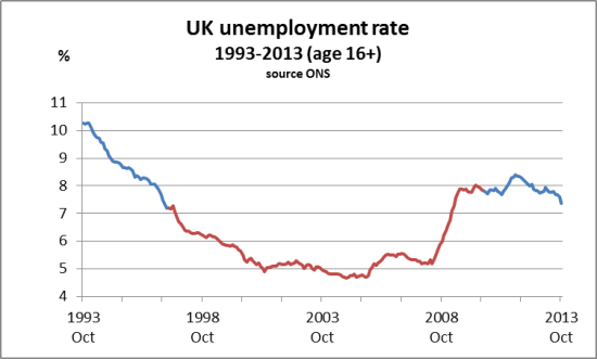
We support the fact that the Governor of the Bank of England had included an unemployment element to the economic tests and “forward guidance”.  It has always been absurd to focus solely on inflation.  But 7% is still very high, by historic and even recent standards.  The following chart shows 20 years of unemployment – and see that from 1997 to 2007, the unemployment rate was far lower than 7%.  Mainly, in fact, around 5%.

Unemployment rate 1993-2003

Unemployment rate 1993-2003

So there is still a long, long way to go.

The real new model – the Green New Deal

The choice of models for the Chancellor, it seems, is between a quick electorally-timed return (we’re on the way) to the old bubble boom and bust model based on exceedingly high private debt, or a shift to the German export-based model with low household consumption and a high savings rate, allied to the Swabian housewife public finance model (no deficits ever!).

This avoids the real choice, which is to invest in a sustainable future for Britain in the new post-carbon economy, in which we play a leading role – and in which employment and economic justice play a far more prominent role.  In other words, the Green New Deal.

2 Responses

  1. It is not at all clear whether you are using GDP per head in this article apart from the membetion of the GDP per hhead in the first paragraph. with pop rising at 400,000p.a the inclusion of per head figures is vital and needs to be muchmore explicit. Douglas

  2. It is not at all clear whether you are using GDP per head in this article apart from the nention of the GDP per hhead in the first paragraph. with pop rising at 400,000 p.a the inclusion of per head figures is vital and needs to be much more explicit. Douglas Other wise a great article Thanks .

Leave a Reply

Your email address will not be published. Required fields are marked *

This website collects cookies and analytic data. To use our website you must consent.
For more information read our Privacy Policy.