

There was much to disagree with in George Osborne’s Budget announced on Wednesday, in particular the increasingly foolish and damaging target to achieve an overall budget surplus of over £10 billion in 2019/20 and 2020/21 via further spending cuts. But one specific claim made by the Chancellor in his speech to the House of Commons was an outright untruth – yet so far, this has been passed over by the mainstream media. Mr Osborne said this:
“Today, I’m publishing new analysis that shows that if we hadn’t taken the action we did in 2010, then cumulative borrowing would have been £930 billion more by the end of the decade than it is now forecast to be.
If we’d taken the advice, Britain would not have been one of the best prepared economies for the current global uncertainties; we would have been one of the worst prepared.”
Now, £930 billion is Quite a Large Sum, about 50% of the UK’s annual GDP. So an average of £93 billion, or 5% of GDP per year over the decade. How on earth does he get there? Let’s see what the Budget Report says:
1.47 The public finances would be in a much worse position had the government not undertaken the fiscal consolidation that has occurred since 2010. Analysis in Chart 1.5 shows that the government would have borrowed an additional £930 billion over the period 2010-11 to 2019-20 compared to the outturn and the OBR forecast.
This is calculated as the path of public sector net borrowing if cyclically adjusted public sector net borrowing (the structural deficit) had been fixed as a share of GDP since 2009-10 at its 2009-10 level. The chart shows the cyclical improvement in the economy since 2009-10 which would have reduced public sector net borrowing from its post war peak of 10.3% of GDP. However, the persistence of the structural deficit means that borrowing would have been higher in every year from 2010-11. [my emphasis].
So here we are told, the analysis is “in Chart 1.5” – a curious place to find analysis. Let’s look at Chart 1.5:
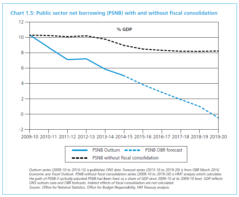
Please now read the small print at the foot of this chart. First, it refers to the fact that the blue line outturn data are from ONS, and the forecast data from the OBR. No complaints from me thus far. But next:
“PSNB [public sector net borrowing – the overall deficit] without fiscal consolidation series …is HMT [Treasury] analysis which calculates the path of PSNB if cyclically-adjusted PSNB had been fixed as a share of GDP since 2009-10 at its 2009-10 level… Indirect effects of consolidation are not calculated”. [my emphasis]
In other words, this is a so-called “calculation” or “analysis” which assumes its own correctness and its own results, and excludes a priori any external effect whatsoever of following an alternative fiscal path. Above all, the effects of the “multiplier” are explicitly ignored. We are asked to believe that for every pound of spending reduction, the deficit falls by a pound. Experience since 2010 proves the falsity of this hypothesis. The truth is, governments cannot control deficits, let alone on a pound-for-pound basis, and can only partly control spending.
Treasury ignore the multiplier
As the Chancellor and the Treasury know, the multiplier is real and often large. There is the negative multiplier, which operates when you cut public spending, especially in a recession or near recession – meaning that GDP falls by more than the cut in spending due to the knock-on impacts. And there is the positive multiplier – by which (unless the economy is close to full capacity) wider economic activity (GDP) increases when government spending increases, by a margin considerably greater than the government’s increase.
Furthermore, the impact of the multiplier is likely to be greater early on in the crisis, making the alleged gap (between what happened and the Aunt Sally counterfactual) much smaller throughout – if gap remained at all.
In fact, absent any assessment of the multiplier, the counterfactual set up by the Treasury is quite meaningless – save as propaganda.
Recall too, as the Chancellor and Treasury well know, the deficit was already falling as a percentage of GDP by May 2010, and we have every expectation that – absent the incoming government’s austerity programme – it would have continued to fall at a similar rate in any event. And as the economy recovered, tax receipts would have increased more rapidly than under austerity.
The Treasury’s analysis is based on false logic, introduced into the Budget Report for no reason than to bolster the ever weakening political case for austerity. For very good reason, the official description of the Treasury’s data sources makes clear that their figures “are… outside the domain of Official Statistics”! (See annex below).
It is a particularly egregious case of the Chancellor setting out to mislead the public with untrue claims based on dodgy statistics.
And worse, the Chart is and will remain a source of deep embarrassment to the Treasury, an enduring public symbol of its sacrifice of intellectual integrity on the altar of political expediency.
ANNEX – Data source (from HM Treasury budget paper)
“Internal Treasury calculations, OBR forecasts and economic estimates, ONS outturn data
Further reference information
These figures are estimates based on HM Treasury analysis and incorporate the underlying assumptions in OBR economic estimates and forecasts. They are therefore outside the domain of Official Statistics. This analysis is based on the calculations set out for paragraph 1.47.
The calculation is the difference between the implied level of cumulative public sector net borrowing between 2009-10 and 2019-20 if the structural deficit had remained constant as a share of GDP from 2009-10 and the level of cumulative public sector net borrowing forecast by the OBR over the same period. The counterfactual path of borrowing is based on HM Treasury analysis of OBR forecasts and data.
The structural deficit is recorded as ‘cyclically-adjusted public sector net borrowing’ (CAPSNB). CAPSNB is held constant, as a share of GDP, at its 2009-10 level across to 2019-20. The figure for CAPSNB in 2009-10 (8.21% of GDP) is taken from the OBR’s Public finances databank (March 2016).
Estimates of the output gap are taken from OBR economic estimates as recorded in OBR’s Public finances databank (March 2016).
The OBR add a cyclical adjustment to headline PSNB to produce CAPSNB. This attempts to account for the estimated cyclical position of the economy in a given year.
To estimate a counterfactual path of PSNB, the OBR’s method for cyclical adjustment is reversed to give an implied path of PSNB, in percentage of GDP terms, consistent with an 8.21% CAPSNB.
Cash terms figures for the PSNB figures are calculated using the GDP measure ‘Money GDP NSA (financial year)’. Outturn GDP figures are from the Office for National Statistics Quarterly National Accounts, series BKTL. Forecast GDP figures are from OBR’s ‘Economic and fiscal outlook’ March 2016.
To calculate the extra cumulative borrowing (cash) figure, the outturn and current OBR forecasts for PSNB (£ billion) in each financial year 2009-10 to 2019-20 are summed together and subtracted from the counterfactual cumulative sum of PSNB over the same period.
Outturn PNSB is taken from latest ONS public sector finances release (March 2016): “Public sector net borrowing (£ billion)”: series J5II. PSNB forecasts are taken from OBR, ‘Economic and fiscal outlook’ March 2016.
This measure is a proxy for the impact on borrowing of fiscal consolidation since 2009-10. This analysis does not calculate the indirect effects of fiscal consolidation.” [my emphasis]


